Guiding Questions
This week, we set out to answer two key questions about presidential elections in the United States.
- How competitive are presidential elections in the United States?
- Which states vote blue/red and how consistently? There are many ways to approach these questions, especially with predictive ends in mind. Is it possible to gather enough data points about a state to accurately understand the likelihood of its individual outcome in the upcoming election?
Analysis & Visualization
In lab this week, we explored popular vote data and electoral college data in order to understand these concepts. To understand the first question, the competitiveness of presidential elections, one of the most common auxiliary questions could be how close elections are. We can look into this by examining the two-party popular vote share of each candidate, in which the closest election would have 50% for each candidate. The following graph we created in lab can represent the competitiveness of elections over time:
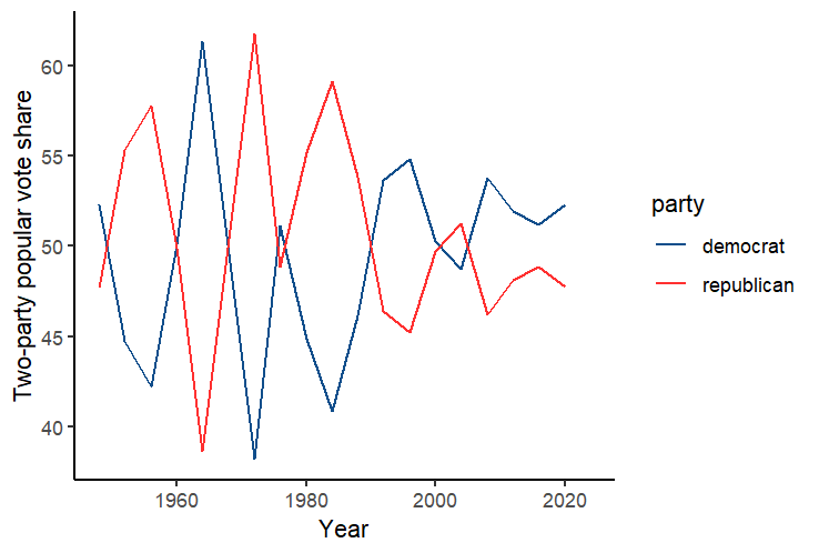
This suggests broadly that elections in recent years have been closer, and likely more competitive as a result, while previous elections had very large margins of victory, even if they alternated each term. Other measures of competitiveness, which could be implemented in the future, include advertising dollars spent on campaigning, or other measures of the intensity of campaigns. In addition, an aspect of competitiveness that this graph does not consider is the number of candidates; although United States elections frequently have two truly viable candidates, primary competitiveness could be another interesting variable to analyze. (for example, the 2024 Democratic presidential primary was less competitive, while 2016 was very competitive - analyzing data points like this across a large number of past elections could be interesting.) To answer the second question, using electoral map data could help understand which states vote blue and red and how frequently. The following visualization we created in lab represents these numbers for the popular vote in each state in the most recent presidential election in 2020:

To create a finalized electoral prediction, I followed the example set in the lab for an electoral vote prediction, based on ¾ of the previous vote share added to ¼ of the vote share from two elections back, and then graph the prediction across states using a color scale to suggest a predicted margin of victory.
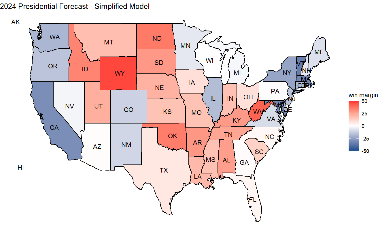
This method of prediction resulted in 276 votes for the Democratic Party and 262 for the Republican Party. However, this is just one way to create a prediction based on the datasets at hand.
An alternative method would be to use even more past data, so I tried implementing other formulas that used the three most recent elections (0.5prev + 0.25lag1 + 0.25lag2) and (0.33prev + 0.33lag1 + 0.33lag2), where prev is the 2020 stat, lag1 is the 2016 stat and lag2 is the 2012 stat. However, I found that these actually had quite similar results to the original model, and while the margins changed a little, the overall electoral prediction didn’t actually change.
Extensions I followed the first suggested extension, which involved adding state abbreviations to the map and setting ggplot themes (I used the classic theme for the first graph and stuck with the void theme for the second two due to the prevalence of axes in the other themes). I also experimented with the predictive formula as discussed above.